How I built eliel.work
A portfolio for a senior full-stack engineer is a strange object. The person reading it can read code, so pretty animation alone does not impress them. But the page also has to load on mobile in under two seconds, rank organically, and convince a recruiter who knows nothing about your stack that you take craft seriously. The bar is high:
- Lighthouse in the green across every metric on throttled mobile, and honestly so, measured on PageSpeed rather than only on my own machine.
- Animation that evokes Apple’s level of care without becoming a playground.
- Editorial typography that carries the page’s voice, instead of a pile of utilities pretending to have personality.
- Two languages (English as the default, Portuguese as a mirror) without doubling the maintenance cost.
Here is how the site you are reading came together, including the mistakes I made along the way.
The stack
I am a daily Next.js user, but Next.js is not what I picked here.
A portfolio is roughly 80% static content and 20% animation. Next.js ships the React runtime on every page, even when the page is structurally static, which costs 50 to 80 KB of JavaScript to hydrate components that never move. On a throttled mobile profile, that difference separates a 100 from a 92 in Lighthouse Performance. Astro emits HTML at build time and only hydrates the islands you declare.
So the choice was Astro 5 with output: 'static', React islands for GSAP, MDX content collections for the case studies and this blog, and Tailwind v4 with a @theme block that drives every token from the DESIGN.md file. Deployment runs on Cloudflare Pages, fully static, with no edge runtime needed in this first version.
The cost of that decision is real: Astro does not give me the same Next.js mental model I have sharpened over years. But I would rather pay that price once than carry the performance tax on every page load.
Fraunces and Geist instead of Domaine and ABC Favorit
The design is consciously inspired by Resend: a black canvas, generously sized editorial serif headlines, atmospheric glows in low-opacity colors, and no shadows. Resend uses Domaine Display and ABC Favorit, both proprietary and expensive.
For a personal portfolio, paying 200 to 600 dollars per font style is overkill. These were the substitutions:
- Fraunces (variable, with optical sizing) replaces Domaine Display at headline sizes from 76 to 96 px. With the
ss01andligafeatures turned on, it is the closest free serif in voice. - Geist replaces ABC Favorit in body copy. It has less personality than the original at 16 px, which I compensate for with slightly tighter letter-spacing.
- Inter handles UI labels, and Geist Mono handles code.
All four are self-hosted via fontsource. The variable Fraunces is preloaded for the top of the page, and the rest load with font-display: swap.
One detail cost me an hour of debugging: fontsource declares the family as 'Geist Sans', not 'Geist'. Get the name wrong and the browser falls back to the system font without complaining.
GSAP inside React islands
The animation map is four deliberate moments, not a parade:
- The headline at the top. GSAP’s
SplitTextbreaks the<h1>into words and reveals them with a slight stagger, coming out of a blur and rising into place. - The work preview.
ScrollTriggerpins the section for one screen height while three case study cards appear in sequence. - The FortCred numbers band. Counters animate from zero to their final values over 1.6 seconds. Numbers above a thousand render with a locale-aware thousands separator.
- The page transitions. Astro’s native
<ClientRouter />drives the browser’s View Transitions API. Card titles carry aview-transition-name, so the title morphs smoothly when navigating from the listing into the dedicated page.
Each animation lives in a React component that consumes GSAP through the useGSAP hook from the @gsap/react package. The hook runs the animation inside a gsap.context() and cleans it up automatically when the component unmounts, which matters because Astro’s page transitions tear down components during navigation.
I import these islands into the matching .astro page with client:visible, so the code for the numbers band is not downloaded until the user scrolls to it. The top of the page, which appears immediately, uses client:load, since there is no point waiting for a visibility check when the section is the first thing on screen.
A less obvious detail: the prefers-reduced-motion: reduce preference turns off every island. The static markup is already at its final visual state, so anyone who prefers less motion sees everything instantly, with no animation running.
The button arrow that everyone copies
The site’s buttons make the move you have seen on so many landing pages: the arrow appears on hover, sliding in while the text shifts a little. The most common implementation animates width with overflow-hidden, which janks on Safari. The cleaner version uses CSS grid columns:
<button class="group inline-flex items-center">
  <span class="transition-transform group-hover:-translate-x-0.5">
    {label}
  </span>
  <span class="grid grid-cols-[0fr] group-hover:grid-cols-[1fr]
               transition-[grid-template-columns] duration-200">
    <span class="overflow-hidden">
      <ArrowRight class="ml-1.5 -translate-x-1.5 opacity-0
                         group-hover:translate-x-0 group-hover:opacity-100
                         transition-all duration-200" />
    </span>
  </span>
</button>
The arrow’s column animates from 0fr to 1fr, the natural width of the content, with no hardcoded value. The icon fades while it translates, and the text gets a small nudge to the left for emphasis. Two hundred milliseconds with ease-out and no jank.
Performance: the splash screen that cost two seconds
The first real Lighthouse run, taken on the deployed site rather than on my computer, came back at 82 on mobile. Total Blocking Time and Cumulative Layout Shift were already zero, because the JavaScript is light and nothing moves during load. The problem was all in rendering, with the Largest Contentful Paint (the LCP) taking 3.6 seconds.
The cause was, with some irony, the element I liked the most: the branded splash screen. The text “eliel.work” appears with an animation on first load and, the way I had built it, the “.work” part started invisible and only showed up after React hydrated the component. Lighthouse pointed to that very element as the page’s LCP, and it stayed hidden for about two seconds, waiting on hydration. In practice, I had turned my own brand into the slowest element on the site.
The fix was simple to the point of being embarrassing: ship the full text already visible in the initial HTML. The exit animation stays the same, it just stopped hiding the content before the first paint. That single change dropped the Speed Index from 5.8 to 2.8 seconds.
There is a lesson here: a beautiful entrance animation can be exactly what is slowing your page down. Before optimizing anything else, it is worth checking which element Lighthouse points to as the LCP.
Two smaller adjustments finished the job:
- The avatar was a 384 by 384 image displayed in a 96-pixel slot. A
srcsetwith 128, 256, and 384 versions lets the browser pick the smallest suitable one, which on mobile means about 5 KB instead of 10. - The CSS was loaded as a separate file, blocking rendering. Astro’s
build.inlineStylesheets: 'always'option inlines the whole 10 KB directly into the HTML and removes that extra request.
Where it all landed:
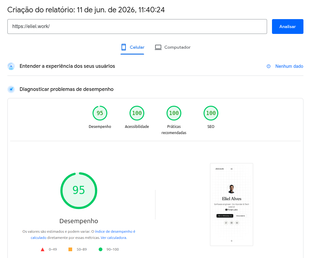
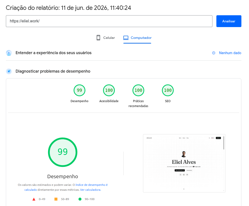
That is 95 on mobile, 99 on desktop, and 100 in accessibility, best practices, and SEO on both. The five points missing on mobile come from the splash screen and the entrance animation at the top, a deliberate choice. I could remove both and reach 100, but I think the brand moment is worth those points. What matters is knowing exactly what you are trading.
There was also a round dedicated to accessibility, which fixed what Lighthouse rightly flagged: footer text with contrast slightly below the recommended minimum, a heading that jumped from h1 to h3, the Forge Labs logo being announced twice by screen readers, a “Read more” link with no context, and a language switcher whose accessible name did not match its visible text. None of it is noticeable to most people, but it is the difference between a 92 and a 100, and, more importantly, between a site anyone can use and one that excludes part of the audience.
i18n without doubling the code
Astro 5’s language routing puts English at the root (/) and Portuguese at /pt/. Content collections are organized by language folder (src/content/work/en/ and src/content/work/pt/), and the lookup helpers in src/lib/content.ts filter by prefix. The hreflang tags, including x-default, are generated on every page by a <SeoHead> component, and the sitemap pairs each URL with its counterpart in the other language.
I treat the English side as canonical for international search. The Portuguese mirror serves the part of my work that happens in Brazil: clients, content for the community, and anyone who would rather read in Portuguese. Adding a new case study means creating a single MDX file in each language folder, with no code touched.
Getting the site onto Google, and an unexpected phishing alert
Having a fast site is half the job. The other half is making Google aware it exists. The mechanical part is unglamorous but deserves care: creating a Domain-type property in Search Console (verified with a DNS TXT record, which covers every subdomain at once), submitting the sitemap, and pushing the main pages through URL Inspection to speed up indexing. Bing takes a few minutes, since it imports the data straight from Search Console, and today Bing’s index also feeds the AI-powered searches.
One detail I am recording for anyone who hits the same scare: Search Console reported “couldn’t fetch” the sitemap for several days. The file was correct, responding with status 200 and valid XML, even to Google’s crawler. It is known behavior. The index is processed right away, but the child sitemaps go into a separate queue and show that status until the crawler actually reaches them. On a new domain, that can take days. There is nothing to fix, you just wait.
Then came the part I did not expect. Search Console flagged a security issue, possible phishing, on a static portfolio with no forms at all.
The explanation is in the Domain-type property itself, which covers every subdomain. I keep a self-hosted instance of n8n, an automation tool, running on a subdomain. Google’s security crawler found that tool’s login screen, a login form for a known product on a personal domain it did not recognize, and classified it as possible credential theft. It is a common false positive for anyone hosting this kind of application. The trouble is that the alert makes no such distinction and can show a red “deceptive site” warning across the entire domain, including the portfolio I send to recruiters.
The fix was something I should have done from the start anyway: put the tool’s login behind Cloudflare Access, the Zero Trust layer available on the free plan. Now any public access to the subdomain is intercepted by Cloudflare’s own authentication screen, a pattern Google recognizes as legitimate, and the login is never exposed. The one thing to handle was the resources that need to stay public, such as incoming webhooks. For those, I created a specific exception and kept everything else protected.
The most valuable lesson from this stage is not technical. A Domain-type property audits your entire domain, which includes side projects, test environments, and internal tools. If you expose services on subdomains of your personal brand, treat them with the same care as the main page. The ideal is to keep any tool with a login on a separate domain and protected before a crawler finds it.
What I would do differently
If I started over, I would probably choose the same stack. The points I would tighten:
- Caching the Open Graph images. They are currently regenerated on every build by satori. A content-hash gate would cut the build time in continuous integration.
- Lenis on slower devices. I would pull the inertia coefficient down a notch for entry-level Android phones, since the default feels great on an M1 MacBook but a bit heavy on a two-year-old phone.
- Subdomain organization from day one. The phishing alert would never have happened if the side projects had not shared the domain of my brand. Today, I would put any tool with a login on a separate domain and protected from the first day.
In the end, the content is only half the story. The full code lives in the repository, and you can see how each decision holds up by browsing the case studies, which is where the engineering reasoning shows up against real production constraints.